Ne rimangono solo 3 a questo prezzo
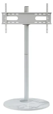
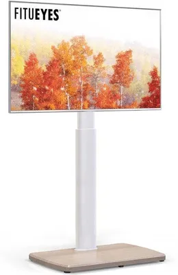
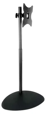
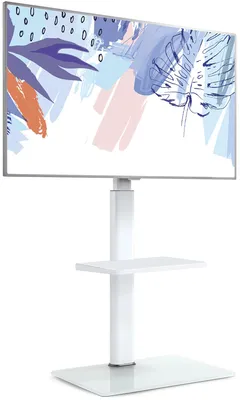
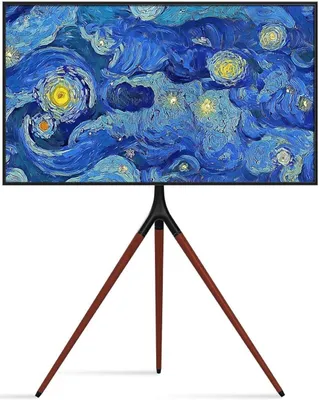
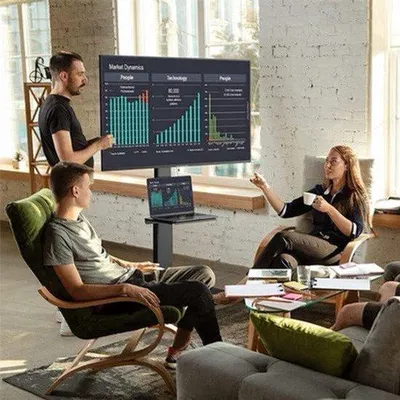
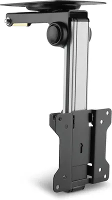
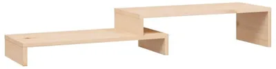
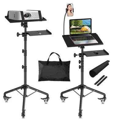
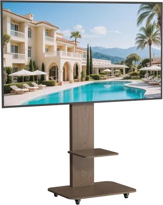
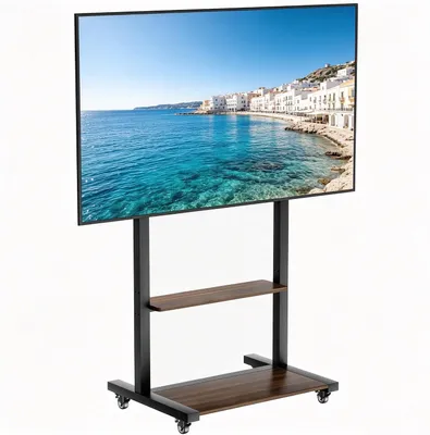
Supporto TV a treppiede per schermi LCD, LED e OLED da 40 a 65 pollici, regolabile in altezza e orientabile, supporto per TV da pavimento portatile con piano in legno

Prodotti simili
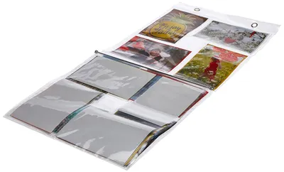
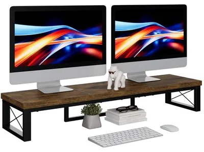
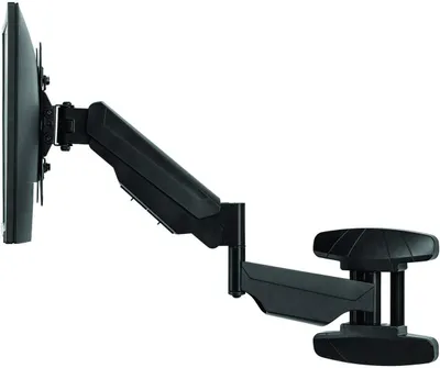
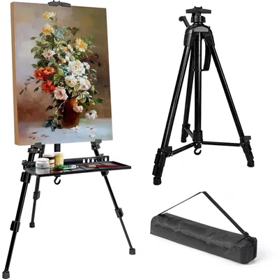

Prodotti simili


Ancora nessuna recensione dei clienti disponibile

Per questo prodotto non sono ancora disponibili recensioni.
I nostri suggerimenti per te
Ulteriori informazioni in merito all’annuncio

Set di 2 cavalletti centrali per Kawasaki Versys 650 22-25
409,99 €

Cavalletto centrale per Kawasaki Versys 650 22-25
249,99 €

Estensione piede cavalletto laterale per Harley Pan Am 1250 / S nero
85,99 €

Costruzione di tetti piani Telaio 4-pack per 2 impianti fotovoltaici horizontal/landscape-4-steun-platdak-horizontaal
142,74 €

Portaombrelli Relaxdays XL, portaombrelli rettangolare per ombrelli e bastoni da passeggio, acciaio, 48 x 40 x 15 cm, nero
64,99 €

Portaombrelli Relaxdays XL, portaombrelli rettangolare per ombrelli e bastoni da passeggio, acciaio, 48 x 40 x 15 cm, bianco
64,99 €
-7%59,99 €
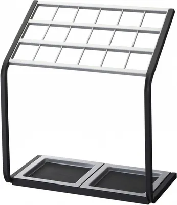
Portaombrelli in metallo "Stand
169,90 €
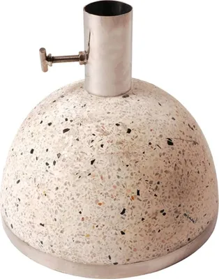
Esschert Design supporto per ombrellone 11,5 kg S Bianco PV09
108,20 €

Non importa quale sia lo spazio di archiviazione - Flexishelf
17,90 €

Organizzatore per ombrelli sottile e alto Relaxdays, in acciaio inox, antiscivolo, grigio.
39,99 €

Relaxdays Portaoleggi in bambù, squadrato, 2 maniglie, A x L x P: ca. 64 x 25 x 26,5 cm, portaombrelli, portaoleggi, naturale
33,99 €

Portaombrelli Umbra Bellwood, nero/noce
54,53 €
-8%49,99 €
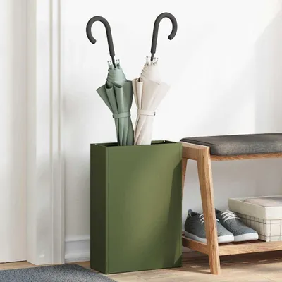
vidaXL Portaombrelli, verde oliva, 28 x 12 x 41 cm, acciaio
47,99 €
-16%39,99 €
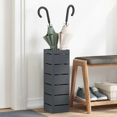
vidaXL Portaombrelli antracite, 15,5 x 15,5 x 49 cm, acciaio
45,99 €
-13%39,99 €
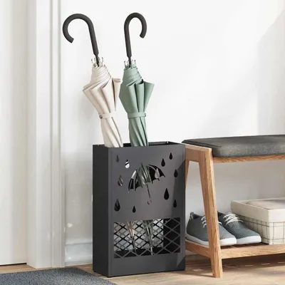
vidaXL Portaombrelli nero, 28 x 12 x 41 cm, acciaio
47,99 €
-18%38,99 €

vidaXL Portaombrelli con contenitore, colore verde oliva, 15,5 x 15,5 x 49 cm, acciaio
46,99 €
-17%38,99 €

Portaombrelli Relaxdays, acciaio, A x P: 50 x 26 cm, supporto per bastoni da passeggio e ombrelli, design a griglia, antracite
27,99 €

Portaombrelli quadrato in metallo RD47530, argento
27,99 €

Portaombrelli quadrato in metallo RD47530, nero
29,99 €
-6%27,99 €

Portaombrelli Relaxdays, A x P: 52,5 x 16 cm, metallo, portaombrelli rotondo, design moderno, argento
24,99 €